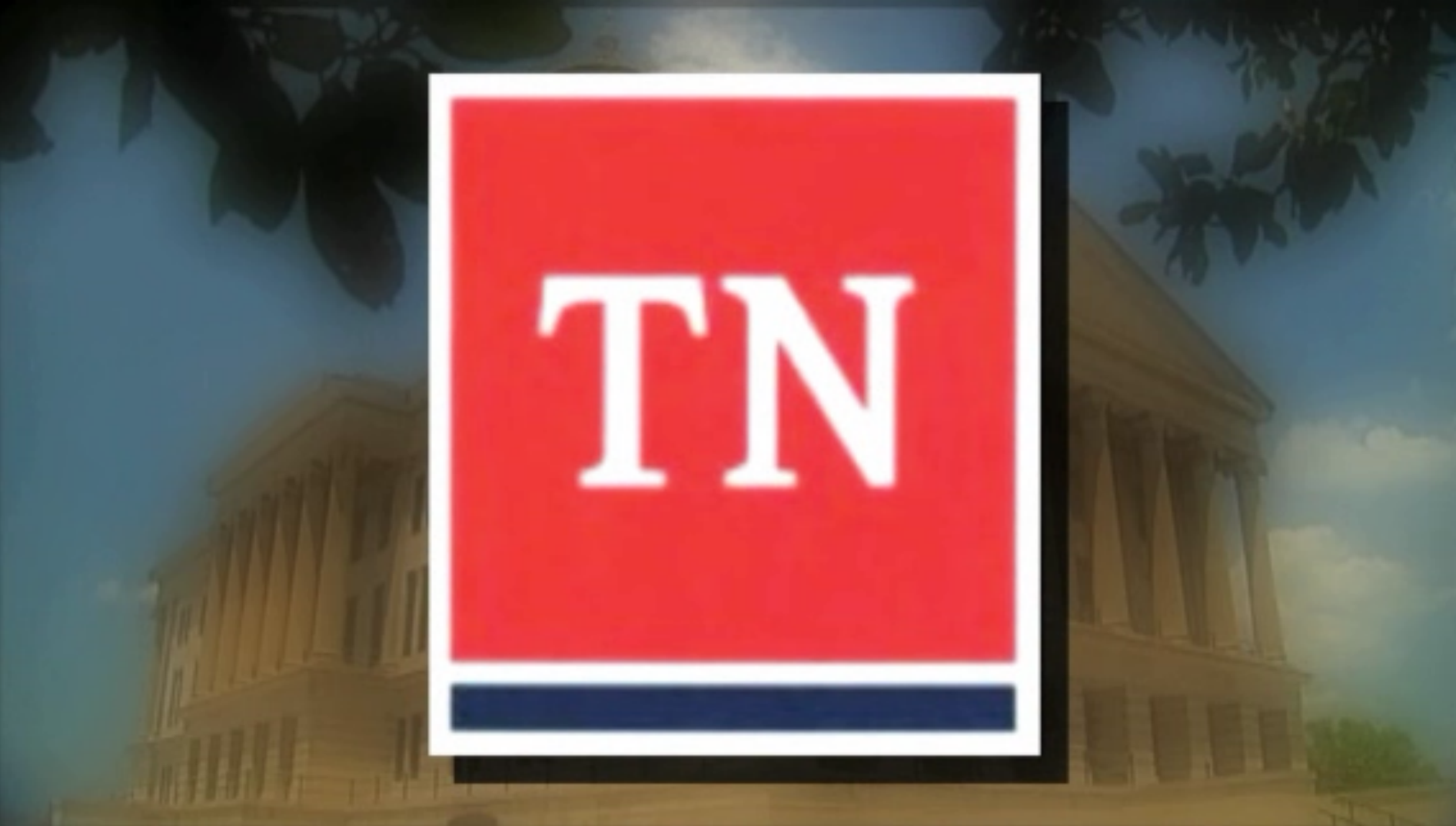
By now, just about everyone has seen the new proposed state logo for the state of Tennessee and it is almost unanimously hated.
The logo, itself, is very simple: just the state abbreviation in a red box, with white and blue lines underneath. The popular criticism for the logo is that a child could probably make it (and they probably could). The kicker for most people is not, in fact, how simple the logo is; it’s the price tag for the logo: a whopping $46,000.
David Smith, a spokesperson for Gov. Bill Haslam, confirmed to The Tennessean on Tuesday, May 26, that the reported cost of the logo was indeed $46,000 and was designed by Nashville-based firm GS&F. However, the new logo would not be replacing the tri-star logo and Tennessee flag that everyone is familiar with.
“To be clear, nothing is happening to the flag, tri-stars or state seal,” Smith told The Tennessean. “There is no singular graphic identity for state government currently. This [is] about a consistent graphic identity for state government. The flag and tri-stars are bigger than state government.”
Even though this new logo is not going to replace the tri-star logo that everyone is familiar with, $46,000 is a lot of money that could be put to a lot better use. Does the state really need any more logos? Not really. Why not make the tri-star logo the ‘consistent graphic identity’ for state government? It makes absolutely no sense to be spending that kind of money on something so needless. There are plenty of other projects the state could use the taxpayers’ money on.
What’s especially troubling is that the company that designed the logo won the contract because they were the lowest bid, which to be fair, is how business works. But they released a product that someone at the fifth-grade level could design in Microsoft Word within 10 minutes. If the state is absolutely set on spending $46,000 on a new logo, why not use the talent of a college student? Why not use give a graphic design major, who’s struggling with student loan debt, the chance to prove that they’ve learned something? There isn’t a graphic design major or graduate that would turn that down. Plus, their work would probably be worth the $46,000 that was spent.
The point is, there are a lot of better uses for $46,000 in taxpayer money other than another new logo, and if we’re going to spend that kind of money on a logo, at least make it a decent one.


